

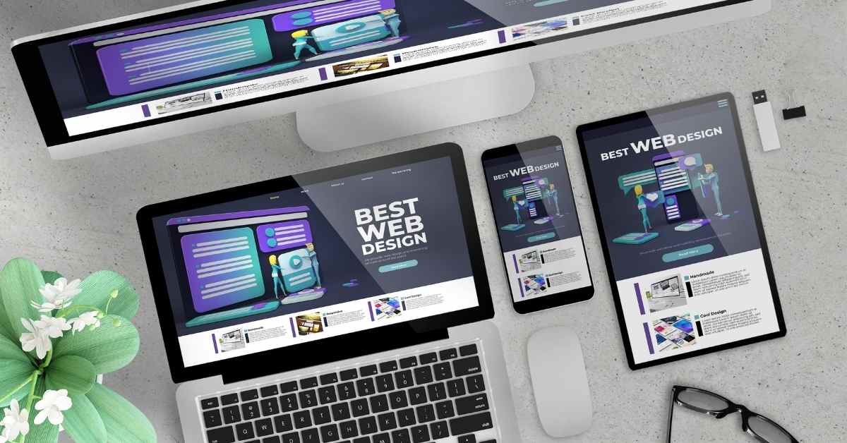
Why Responsive Web Design Matters in Today’s Mobile-First World
Over 55% of global web traffic now comes from mobile devices, underscoring the importance of responsive web design (RWD). It’s a design approach that ensures a website automatically adjusts its layout, images, and content to fit the device it’s being viewed on, whether it’s a desktop, tablet, or smartphone.
This adaptability solves a significant issue many users face: navigating a site that isn’t optimized for their device. Understanding the basics of responsive design is crucial for businesses aiming to create a seamless user experience.
Let’s discover the definition, principles, and benefits of such a design so you can create it yourself!
What Responsive Web Design Is
RWD is a modern approach to web development, ensuring a website looks good and functions efficiently across various devices. The process involves creating a site that adapts its layout, images, and content to fit the screen size and orientation of the device.
By doing this, your users can get an optimal viewing experience with easy reading and navigation.
The key is in the design’s flexibility. Regardless of the device, it leads to a more seamless and engaging interaction with your website.
The Principles of Responsive Web Design
Responsive design hinges on three main principles. Let’s delve into each of these components.
1. Flexible Images
This principle ensures that images in your website design adapt seamlessly to different screen sizes. It’s achieved by setting the image width to 100% of the container’s width. The goal is to prevent images from spilling out of their containing elements when the screen size changes.
2. Fluid Layouts
Fluid layouts use relative units, like percentages, rather than fixed units, like pixels, to define elements’ size. So, if a column is set to take up 50% of the screen width, it will maintain this proportion on a large desktop screen or a smaller mobile device.
3. CSS Media Queries
Media queries allow you to apply different sets of CSS rules based on the characteristics of the device or display, such as its width, height, or orientation. For example, you might have one set of CSS rules for screens wider than 600 pixels and a different set for smaller screens.
The Concept of Responsive Web Design
Responsive design, a term coined by Ethan Marcotte, is about creating web pages that look and work well on any device. As screens vary in size, the layout shifts to provide the best viewing experience.
For instance, on a phone, content might appear in a single column, while on a tablet, it might spread out over two columns, and on a desktop, it could expand further.
8 Benefits Offered by Responsive Web Design
RWD offers several significant benefits. Here’s a deeper look into nine key advantages:
1. Draws More Mobile Users and Traffic
RWD ensures that websites render correctly on smaller screens, providing an optimal experience for mobile users.
By adapting to various screen sizes, responsive design helps businesses reach a broader audience, making their website accessible and user-friendly across all devices.
2. Quick, Cost-Effective Development
Building a responsive website is generally faster and less costly than creating a separate mobile application alongside a standard desktop website.
While the initial investment might be higher than developing two separate websites, the long-term savings are significant. It’s due to lower maintenance costs and eliminating the need for unique configurations for a site that operates in two versions.
3. Simplified Site Maintenance
Unlike maintaining separate sites for mobile and desktop, responsive design uses standardized testing methodologies, ensuring optimal layout across all screens. This approach eliminates the need for multiple content strategies, administrative interfaces, and design teams, simplifying website maintenance.
It allows businesses and developers to focus more on essential aspects like marketing and content creation rather than spending excessive time on website upkeep.
4. Quicker Web Page Loading
Responsive websites are optimized for speed, ensuring they load quickly on all devices. It is crucial because a delay of even a few seconds in page load time can significantly impact user satisfaction.
Techniques like image optimization and responsive image solutions contribute to faster loading times, especially for mobile users with slower internet connections.
5. Lower Bounce Rate
Bounce rate measures how many people visit a website and leave it after only looking at one page. A high bounce rate often indicates an ineffective or unappealing website.
Responsive web design helps lower this rate by providing a user-friendly experience across all devices. When a website is easy to navigate and read on any device, users are likelier to stay longer and explore more pages.
6. Boost Conversion Rates
A seamless experience on mobile devices is essential, as more consumers are using their smartphones for shopping and other activities. Responsive design ensures that call-to-action (CTA) buttons and forms are easily accessible and usable on all devices, increasing the likelihood of conversions.
7. Easier Analytics Tracking
With a single responsive site, tracking and analyzing becomes simple. Tools like Google Analytics are now optimized for responsive websites, offering consolidated reports that show how content performs across different devices.
This simplification is a massive plus for website managers and marketers, allowing for more efficient and accurate data analysis.
8. Enhance SEO Performance
A mobile-optimized site contributes to stronger backlinks and lower bounce rates, both favorable for higher search rankings. Additionally, since April 2015, Google has used mobile-friendliness as a ranking signal. Moreover, a single responsive site avoids the problem of duplicate content, which can negatively affect search rankings.
Conclusion
In conclusion, responsive web design is a fundamental approach to web development that addresses the diverse range of devices used today. The benefits are clear and impactful, from enhancing user experience to improving SEO rankings. It also simplifies website management and ensures your site is accessible to a broader audience, regardless of their device.
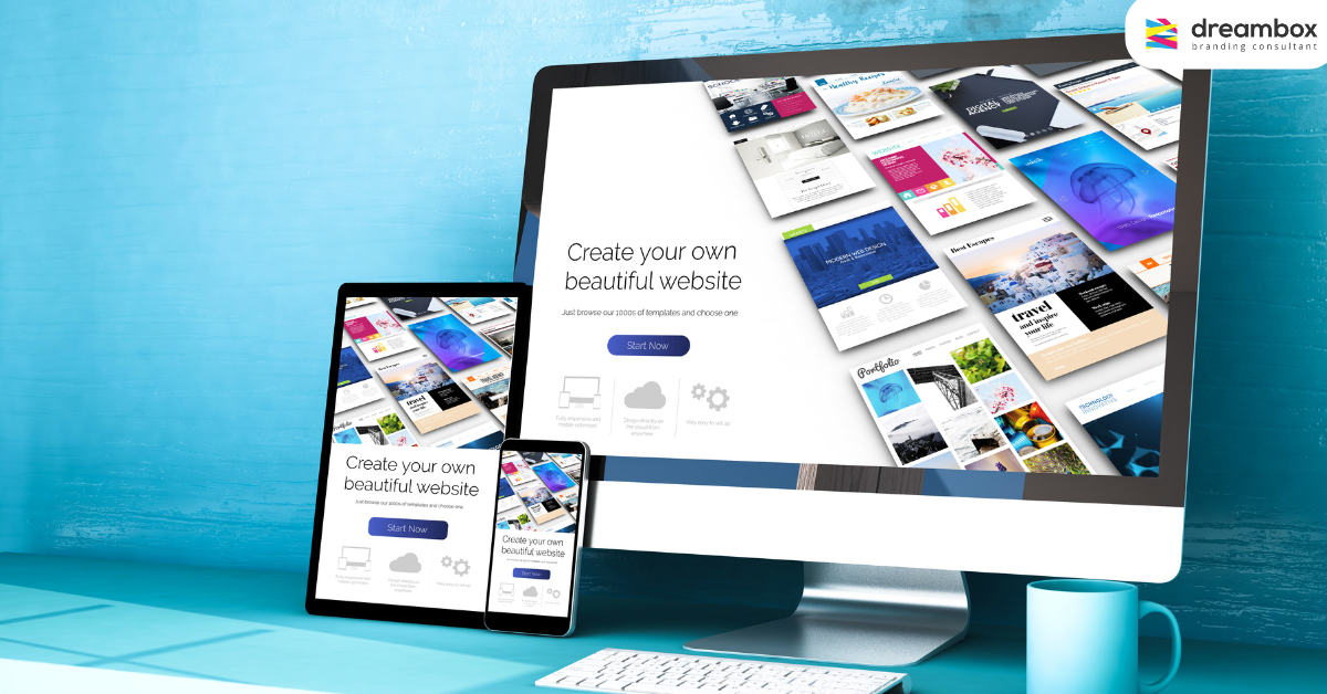
Consider making your website mobile-first but unsure where to start? Dreambox can be your go-to partner. Our team understands the nuances of responsive design, focusing on speed, usability, and content prioritization to engage your mobile audience effectively.
Visit our homepage or website development service page for a comprehensive view of how Dreambox can boost your online presence. Our contact page is just a click away if you have questions or need more personalized assistance.
